I was approached by a charming cafeteria in downtown Sao Paulo looking to boost their online sales.
Client
Crio Café
ROLE
UX/UI, Front-End Development
Delivered
2021
Delicious coffee and tasty bread. Good location, brand and awesome customer service. Sounds like a great recipe and it is! I was tasked with improving the only lackluster touchpoint on Crio Café’s awesome customer experience strategy.
delivered May 2021, current status might not reflect development results
#iurycases
"Worthy of their customers"
That was the concept behind the complete overhaul on Crio’s e-commerce platform.
Crio’s coffee is so good that customers have developed an almost cult-like following. I mean, the ones that did stick around and followed through the -at the time- cluttered buying process.
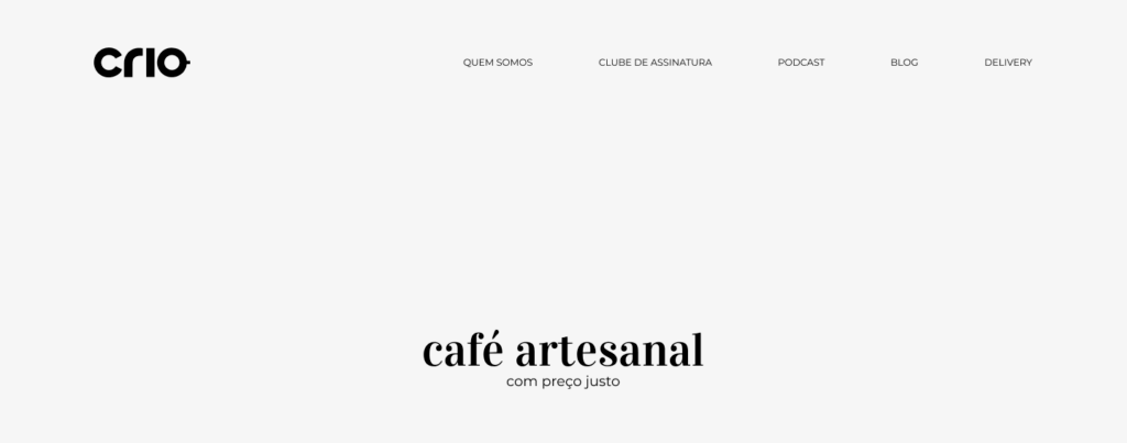
How it looked like, as a consumer...
(That was my first experience on their website. Seriously.)
Step 1. Visit crio.cafe, then look around the page for the delivery button.
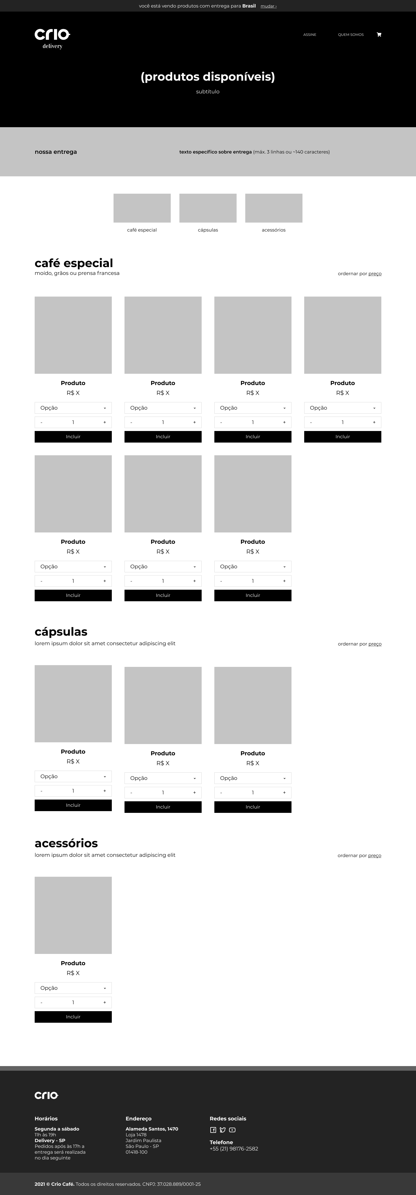
Step 2. Get directed to a page with a similar design to crio.cafe’s, but with a different URL, crio.delivery. Smells phishy.
Step 3. Realize it’s not really a phishing site and start browsing the store.
Step 4. Browser uncategorized products, find something really tasty only to realize it can’t be shipped to my city 150km away because it’s going to be spoiled by the time it gets here.
Two things became clear to me right away:
crio.cafe needed work
They had their technical reasons to maintain two URLs so unifying them was off limits. For someone coming for physical store info, it was pretty confusing.
crio.delivery also needed work
I had to fix the onboarding page for direct users and improve the way the delivery system worked and how the page looked and behaved.
So, how I approached it...
First things first. Since the URLs were different, the pages had to look different instead of trying to conceal the redirect.
Light header and minimalist approach for crio.cafe
A dark header and clearly displayed “Delivery” on crio.delivery
Now, we need to tackle the delivery range issue. Crio does not have a logistics staff to deliver frozen/chilled goods across long distances, so they can’t ship their cheese or bread outside the city of Sao Paulo, only coffee.
This might look like an easy enough solution. Just have the browser ask for the user’s location and be done with it, right?
Wrong! Their CMS was so basic that this was completely out of bounds, so I had to come up with a simple, supported, solution.
This was my take on the matter:
crio.cafe
A module inviting users to choose whether they want Crio “today” for courier delivery or “this week” for nationwide shipping.
crio.delivery
Inside the delivery’s homepage, users had to choose their shipping range before seeing which products were available.
This was a more user friendly way to divide the products by directing customers and separating the pages with an URL ending in /brazil or /sp.
Once inside the localized page, a message above the header made it possible to quickly change from Sao Paulo to Brazil without the need to go back.
Been there, done that.
All I had to do now was put some sense in their delicious product line-up. Before, they had everything display at once.
Cheese, breads, ground coffee, coffee beans, coffee pods, filters and mugs with no way whatsoever to get them sorted.
The numbers speak for themselves. Another interesting insight is that users were spending less time (down 2 minutes) browsing the website, yet average customer spending at the store increased by 2.5x. Yay for efficiency!
Thank you Gabriel for trusting me with this one! Photos by Gui Gomes.


